New Responsive Website of Hazara University: Designed By An Ex Student of Hazara University.
The Breakdown
This is an unofficial website which is designed by an ex student of Hazara University. This design is up to date with modern website technology, which means it"s simple, flat, fast and responsive. The reason for designing this website was because people judge the standard of an educational institute, or the quality of a product from the website of institute or university or corporation. The old website was very outdated and boring in every term that looked like a website from 90s. People's behavior changes over time to adapt to modern technology, and so this website uses modern designing trends. Its purpose is to present innovations in Hazara University.Introduction
So this holiday season, I had some free time so I decided to design this website. This is only front page design because for the rest of the things access to server is required, and if I had access to the server & data of Hazara University I would have made this design more dynamic, more fast, with more futuristic features. This website is not complete website therefore when you click on the links it will take you to the old website. Though it is not comple still every single thing from the old website is present on this page, it will take you to old website for the data that is on the servers of Hazara University. The notable thing about this wesite is "Mobile Version."
Responsive design
Not to be confused with site response “speed”, responsive design refers to how a website layout changes when being viewed on a mobile device. If you open it on mobile phone it demonstrates a nicely designed top bar and a the replacement of the main navigation menu with the mobile friendly “hamburger” menu. This is the type of menu that appears as three horizontal lines in the upper righ corner that expands when clicked. Viewing the site on a tablet showes little, slight difference from the desktop experience. All the menu elements appear to remain in place and the site reacts just as it does on a laptop or desktop screen with the same “roll-up” effect. This seems about right as the site appears a little “narrow” when viewed on a standard 1080p computer display.
Desktop Version
The content on the desktop version is arranged almost same as on the old website, but the design is very clear, user friendly and easy to understand. Dropdown menus are now more wider, faster to load and easy to navigate. New website also has a map, much improved content with distinct headingS, and transition effects. Notification section on the page is now all in your control. Unlike the old notification section, now you can pause the notifications as you hover mouse over it, and yes, You can see all notifications at once. The footer is also designed perfectly with social media links and stuff.
scroll down to view full image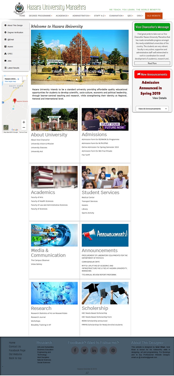
Embedding a map in the website is necessary for brands and institutes, on the bottom left you can see a map of Hazara University from desktop site. Footer now has much more content, just like all the websites of this digital world. Social media links in the footer has fascinating hover effects. As you open the website the first thing you'll probably see is the images slideshow, which is now in the right place with bigger images and caption of images over it. In the old website the image slide show was in the top bar, with low quality small images.
iPad version - Landscape Mode
Landscape version of the site is not much different than the actual site. This version is aimed for iPads but also functional on Android devices when you rotate your phone or tablet to Landscape mode. The content is slightly squuezed to fit inside the screen of an iPad or an Android tablet in landscape mode. Top navbar in this mode appears more simple than long navbar on the desktop version. The content images on the site become oval in shape to appear nice. On iPad Pro, another version of this website is available which is exactly the same as desktop version.
scroll down to view full image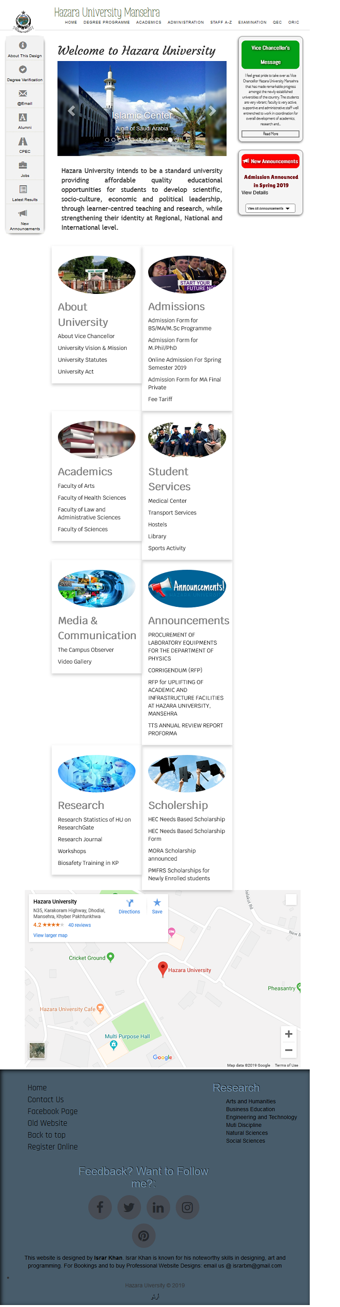
Android Tablets
The Android tablet version of the site has a very nice and user friendly interface with hamburger navigation button on top. Clicking the hamburger icon opens the menu items, which are nicely araanged and easy to navigate. Beneath that, there is another menu with quick links to most important things on the website. As you sroll down you can still view the image slideshow with screen width images. Content section is probably the most beautiful part of mobile site. Content is stacked upon each other with round images on left side. In some cases this version can also load on phablets with high screen resolution.
scroll down to view full image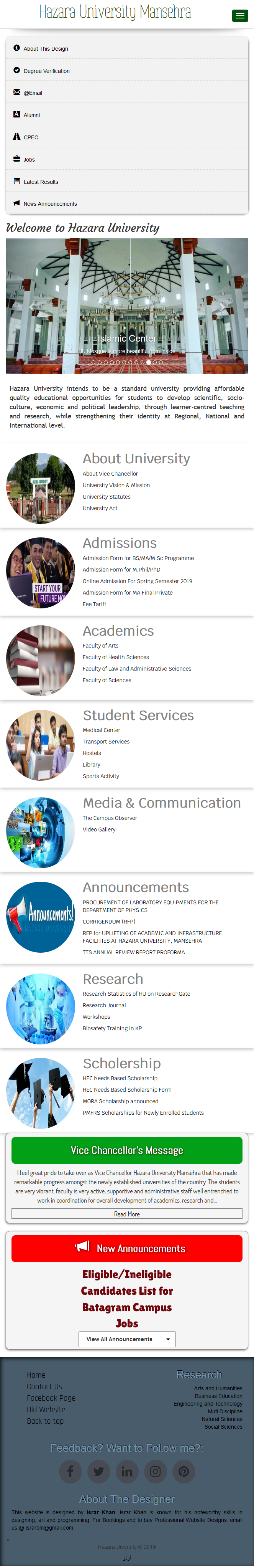
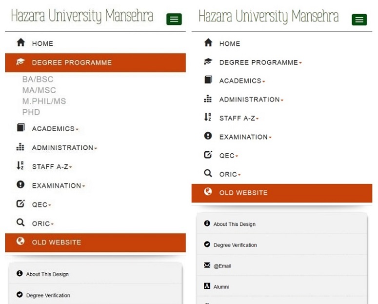
Dropdown menu on mobile phone looks like this:
Mobile Version
On mobile phones with small screen size, the content squeeze a liitle more, and font size of the text become bigger. The images in the content section aligns in the center with content underlying. The rest of the things are same as in Tablet version. Also the map is ditched on Tablet version and Mobile version.
scroll down to view full image
In short this website offers a smoother, more intuitive user experience and features more navigable site content. This design has a lot of pros and no cons.
Pros.
- A beautiful innovated look
- Smoother and more convenient user experience
- Modern flat, simple and white UI.
- Different versions for different devices
- Hambuger menu for mobile menu content
- More control over content
- Many wrongs of the old website are corrected in this.
Cons.
- Only one disadvantage: The links on this site will take you to the old site (because it's not complete yet